Update 1: G00D Graphics
A lot of what I've been trying to do recently has been create a unified aesthetic for Velum Children. A game's visual style, to me, does a lot of work to evoke the kinds of feelings you want the player to experience when playing a game. I don't think this is too controversial a statement, though maybe one could argue sound, or even the absence of sound, has as much to do with establishing a mood as well. I tend to think visuals are more important though. Anyway, the topic of this devblog will be about sick, sick graphics.
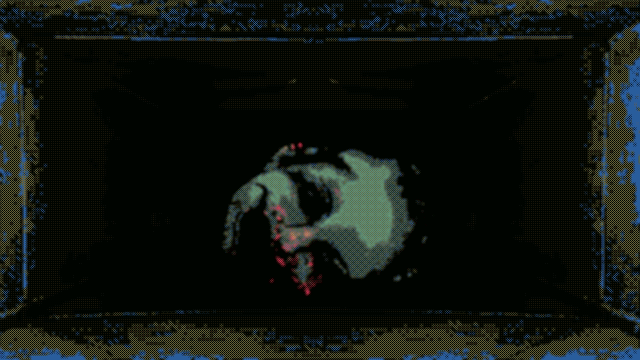
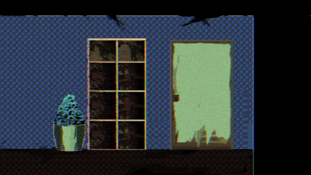
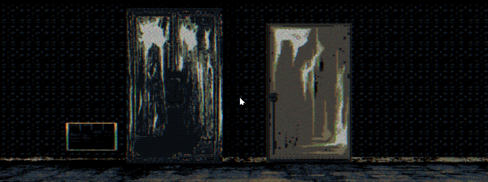
I think distortion and occlusion do a lot for horror visuals. Nothing that has been scary has never been without context and part of the context is how much you are apprehending vs. how much you are understanding. We've all probably had experiences where we've driven down dark roads late at night, alone, feeling vulnerable even though we were in cars (well I have anyway, I scare very easily). Seeing the blurry flank of a deer light up just briefly in your headlights as it trots across along the road is enough to at least make me a little uncomfortable for a second. It's enough to get the imagination going I guess. So, no wonder in video games horror stuff is often distorted and filtered through VHS emulating shaders and dying pixels. Yes, you could look at all retro-hearkening as a sort of symptom of our "lost future" ala Mark Fisher, but also, retro aesthetics serve a lot of practical purposes, especially for horror.
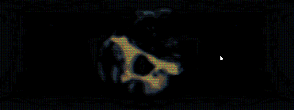
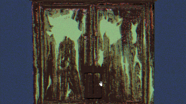
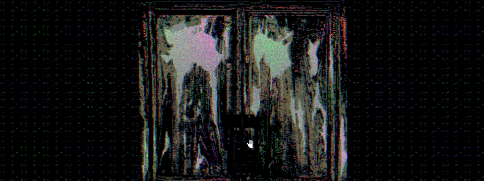
About that unified aesthetic. It has been sort of a moving target for me. At first I really wanted to use a super limited and super ugly color palette. Well, that plan sort of fell by the wayside. Working with a larger and more balanced palette is a lot easier for me, someone who is a novice pixel artist who uses a lot of shortcuts. You can see the palette I was using in the above image, the one that has smaller dimensions than the other head image. The same goes with the screenshot at the bottom with the spooky looking cabinet doors. I think the new colors look a lot better, honestly.
Another aspect of the aesthetic being a moving target has been a general hesitancy to put things down and keep them there. Bennett Foddy says that designing a video game is like working with quick-dry cement, you place things down and then have to go from there. There's very little "starting over". Well, in my case, I actually can start over, because graphically I wanted to remake everything anyway, and since I have the time to do that now, I want to get it right, and I think I am very close to that.
One other thing, I have changed the resolution of my game. I found a lot of my graphics did not upscale well when in fullscreen mode. The ones I have now should work better, or at least will look better with some sort of fullscreen letterboxing effect. I'm going to have to play around with that to see how it works.
The actual process by which I come up with most of my graphics is varied. Sometimes I use rigged 3D models and pose them/take screen shots of them, drop them into my pixel art program of choice, index the colors, draw over most every frame, adjust the lighting/contrast, re-index everything and apply even more effects. I wish I could just straight up draw everything but I only do that like 40% of the time, such is my limited artistic ability. I'm still experimenting too. Sometimes I'll just go on a walk and take pictures with my phone's camera. Sometimes I'll composite images. Nothing's off the table, but I would like to find a way to put everything together that isn't so time consuming, but that ultimately might not be possible.
I feel like I could write a lot more about aesthetic hand-wringing but I have put off posting this too long already. Thanks for reading, and make sure to follow me on twitter (https://twitter.com/stretchamstrung) I post gifs and smaller updates and also loads of other spooky stuff not entirely related to the game.
Comments
Log in with itch.io to leave a comment.